I’m sure through the development of your companys website you have asked “How does that look in (insert browser)?” Rightly so, getting a full and comprehensive understanding of how your companys site renders and functions on all browsers is important. However you may have to begin to provide more attention to one over the rest very soon. This is the mobile browser! The whole world has gone mobile and if you are beginning to lag behind you should prepare yourself to be relegated to the doldrums of search results.
A report in 2012 claimed that 48% of young adults, between the ages of 18-29, believe that they use the internet mostly on their mobile devices. One would have to assume that this is a rising trend, as a report this year says that 50% of teens (aged 12-17) mostly go online with their mobile devices. This new breed of mobile only users are something that you will have to account for, in the design of your companies website. What works on a desktop browser doesn't always translate well to mobile, and can often lead to a bad experience with the company, this may discourage a potential customer from doing business with you. Google, the sultans of search have realized this and in a recent algorithm change they have addressed the problem for their users.
Googles new algorithm has changed the rankings of smartphone search results, so that sites that have not been designed with responsive mobile web capabilities will be demoted to the uncharted territory that are the double digit results pages. But don’t worry, you will be part of a prestigious clique as 66% of Fortune 100 companies will greet you when you arrive. Pure Oxygen Labs’ mobile SEO assessment, has revealed that only 6% of Fortune 100 companies are fully compliant with Googles new requirements for mobile. However you don’t have to stay there forever and Google themselves are even willing to give a helping hand. They recommend that you should serve the same HTML for all devices and only use CSS media queries to decide the rendering on each mobile device.
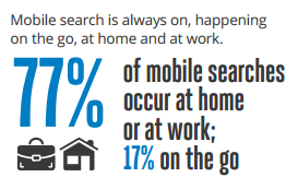
A bad mobile experience of a site cannot be simply put down to unresponsive design, mobile users are not an unknown quantity in terms of what they are looking for. They’re the exact same as any other user and they want the same functionality on their mobile devices as they get on their desktops. There is a misconception that your mobile website should be a subset of your desktop version and that you should tailor your mobile site for people who are on the go. However this is not true. Think about it, how often have you been sat at home watching TV, while surfing the web on a mobile device? Google has even reported that 77% of searches from mobile devices take place either at home or at work! It’s the same users you get on your desktop site, they know what they like and they want it mobile. Simply put, they want the same experience but on a different device. They could go use their desktop but they would rather browse on their mobile device while still watching TV.
Think about it this way, how does it make your company look? What would a person think if they searched for your company on their mobile device only to be greeted by a clunky, difficult to navigate and difficult to read webpage. It makes you seem old, outdated or even just plain lazy. Mobile is the future it’s painfully obvious to everyone, even to people who have no interest in technology. So you need to embrace it, you need to ensure that when a potential customer searches for your site on their mobile device, it’s the first thing they find (well at least on the first page). It is especially important for businesses that involve technology to do so. If you can’t keep your own affairs in order who is going to trust you with theirs? “The shoemakers children go barefoot”.
Nobody's perfect but anything less than a perfect mobile experience is now considered bad, and if you don’t address the situation Google may well remove you from relevancy!